For photographers of any skill level, programs like Lightroom and Adobe Camera Raw have a lot of information to learn. It can be challenging to create an efficient and effective workflow for storing and processing your photos. This post is not meant to be a guide on how to process your photos in Lightroom, but to help you understand some common mistakes and how you can avoid them in your own photos. Remembering these small, but important details will keep your photos from having subtle editing mistakes.
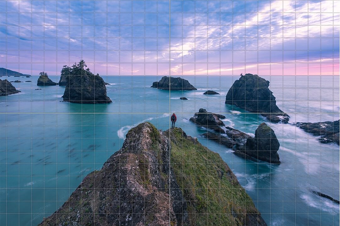
A hiker looks out over the rugged Samuel H. Boardman Scenic corridor along the southern Oregon coast.

Stay Organized
Lightroom is a powerful photo editing tool and an equally powerful organizational tool. As you import more and more images, it’s imperative to have some sort of strategy for organizing your photos. Everyone has a different way of organizing and editing batches of images; there’s no one correct way. Some photographers separate photos by day, others create a folder of a certain location or divide their photos by subject.
Whatever you do, it’s just important to have some sort of strategy. Think long-term, yet don’t make it so complicated that you have a hard time finding your own images. Having a strategy for organizing and editing your photos will pay off dividends in the long run.
Don’t Move Photos Outside of Lightroom
The most common Lightroom complaint I hear is “Lightroom can’t find my photos.” There can be several causes for this, but the most likely is that the photos were moved elsewhere in your computer.
Lightroom doesn’t store full-resolution files. What you see is a preview that Lightroom links to the original file stored on your computer or external hard drive. If you tell Lightroom that the photos are in “Folder A” and then later move them to “Folder B,” the link is broken and Lightroom won’t know where your photos are.
To solve this, Lightroom can search your computer for the files, but the best practice is to move photos within Lightroom. This video on Adobe’s website explains how to move photos in Lightroom.
Chromatic Aberration
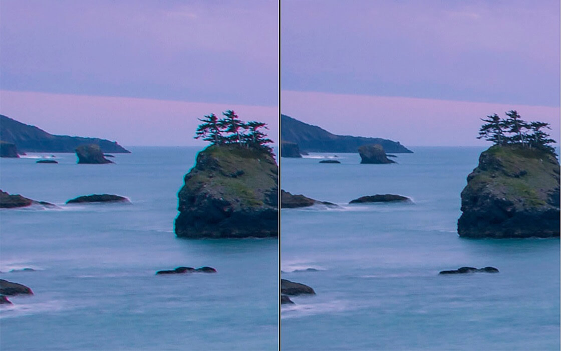
Chromatic Aberration is the colored fringes you see along objects in your photos. Chromatic Aberration is caused when your lens is unable to bring all color wavelengths to the same focal plane. Most lenses have some level of Chromatic Aberration, but wide-angle lenses, zoom lenses, and lower-end lenses are especially susceptible.
Chromatic Aberration not only adds the color fringes where you don’t want them; it also softens your image. The good news is that it’s an incredibly easy fix. Lightroom’s Lens Correction panel can fix it automatically or manually. There is no reason not to check the “Remove Chromatic Aberration” box on every single image.
In this example, you can see the Chromatic Aberration from my 17-40mm lens on the left. The right side is after I clicked the “Remove Chromatic Aberration” box under Lens Corrections in Lightroom’s Develop Module.
Straighten Horizon
This may sound obvious, but you’d be surprised how many photos make it out into the world with slightly tilting horizons. It’s an easy fix either with the crop tool or in the transform panel.
Using the grid (either by grabbing the corner of the crop tool or using the rotate slider under the Transform panel) will help you get the horizon perfectly level.
Mask Edges
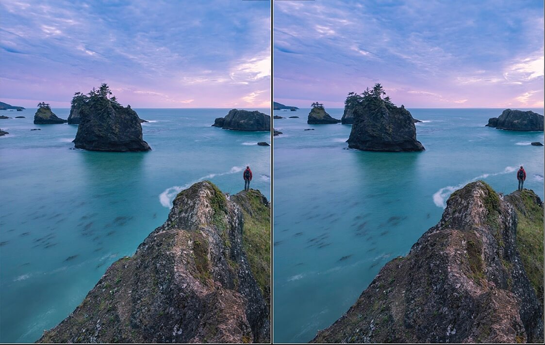
One of the most common editing faux pas I see is sloppy mask edges. When you are making local adjustments with the brush tool, it’s important to be precise with your brush strokes. Say you are trying to lighten the landscape. If your adjustment brush bleeds over into the sky, a halo effect will be visible. Having bad mask edges shows an inattention to detail and can be a major distraction in your photo.
The left photo shows a halo effect caused by a sloppy painting with my adjustment brush. The photo on the right shows a more precise mask where only the rock is lightened and the water is unaffected.
Over-abuse of Sliders
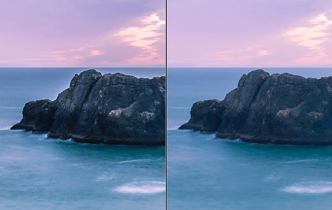
While processing style is largely a personal choice, I would encourage you to not be too heavy-handed when adjusting sliders. You want your viewer to be thinking about the subject and emotions of your photo, not how you processed the photo on your computer. Of course, some photos will require more editing than others, but for the most part, I’ve found that less is more. Be especially mindful with saturation, clarity, and dehaze sliders.
Overuse of certain sliders can really give your image an unrealistic and over-processed feel. It can also introduce unwanted effects. For instance, if too much clarity is used, halos can appear around objects. The halo along the rock in the left image is a result of this. Processing is subjective, but regardless of personal style, you should avoid introducing these types of distracting effects.
Stitching Errors
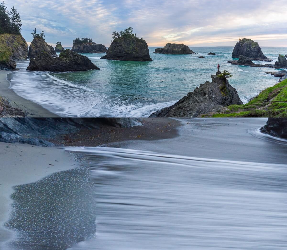
Stitching frames together is a great way to create panoramas and photos with bigger file sizes for large prints. I always encourage people to think about stitching photos to get the most resolution they can. The drawback is that Lightroom can sometimes have a hard time seamlessly combining frames. The best way to prevent errors is by properly shooting the frames in the field, but even with perfection execution, the frames don’t always merge perfectly.
For this reason, always carefully examine your stitched image, checking for errors. Irregularities commonly occur along lines or texture patterns. These problems are easy to overlook, so get in the habit of checking for them right away. Sometimes they can be resolved by having Lightroom/Photoshop run the stitching process again. Other times you can “repair” the irregularity with the clone tool.
While the top panorama looks good at first glance, a closer look revealed a stitching mistake in the wave action. These types of errors can be hard to notice, so it’s important to scan through the image right after it stitches before moving forward.
Cloning Artifacts
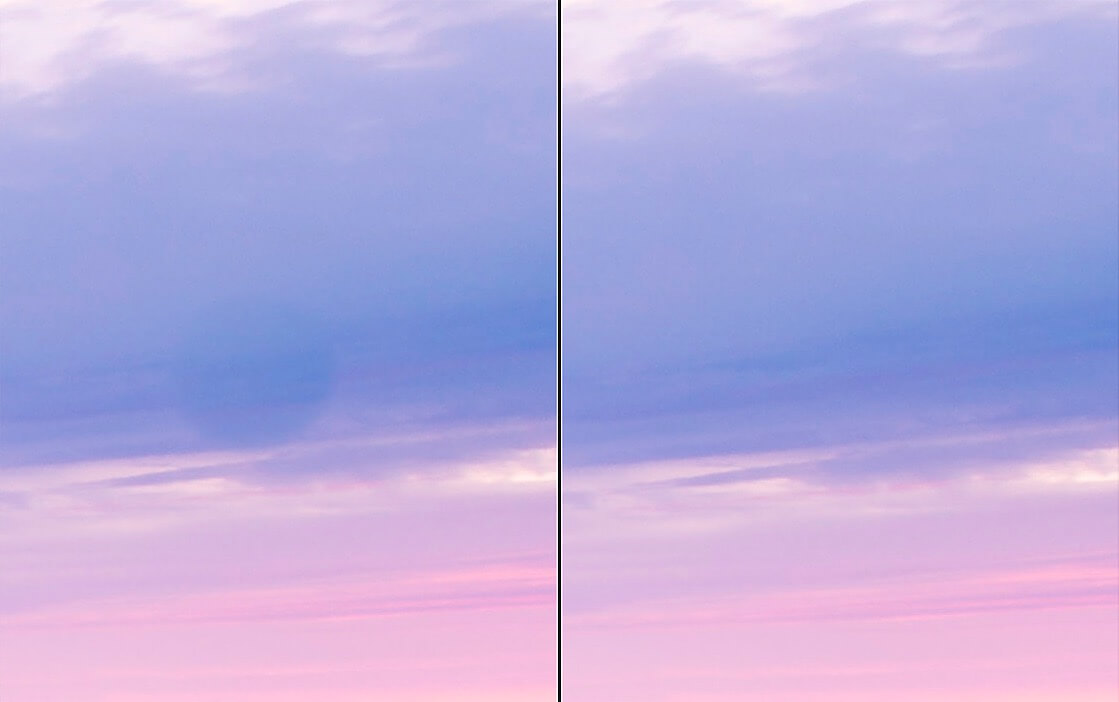
If your camera sensor looks anything like mine, chances are there are a lot of dust spots on it from changing lenses in less-than-ideal conditions. This means that on most photos with big, clear spaces (i.e. a blue sky), I need to go through with the spot removal tool to remove dust spots.
This tool does a good job of selecting the problem area and sampling new pixels to cover it up with. Even though it works well most of the time, it isn’t always perfect. That’s why it’s important to go back and double-check that you didn’t cause more problems with the spot removal tool. Sometimes the tool reads slightly wrong tones or samples pixels from a textured area that leaves an artifact instead of fixing a problem. Double-checking where the tool sampled from will keep you from having tree textures in the middle of a blue sky.
Most of the time, the spot removal tool is good at matching textures and tones, but it’s nevertheless important to double-check for artifacts. In the image on the left, you can clearly see a dark circle where the spot removal tool sampled from somewhere too dark and didn’t align the clouds just right. This was easily fixed by moving the tool around to find a better match.