Color is a game-changer in photography, shaping mood, style, and impact. From bold primary hues to subtle grading techniques, mastering color transforms ordinary shots into unforgettable images. In this roundup, we’ve got four guides to help you use color creatively and effectively.
1) Monochromatic Color: One Color Creates Interest and Mood

Monochromatic photography is where a single color, with its tints and shades, dominates the composition. It’s all about using that one color to evoke mood - for example, reds for passion, blues for melancholy etc., while textures, contrast, and tones add depth and interest. Think of it like a creative challenge that sharpens your eye for color and emotion, regardless of what your subject matter is. Think about how you can create thoughtful compositions, and how different hues affect a viewer’s emotions. Monochrome isn’t just grayscale—it’s an artful way to make a bold, emotional statement with one color. Read more →
2) Using Primary Colors for Visual Impact

Learn how to use the primary colors—red, blue, and yellow—to make your photos more impactful. Red brings energy and passion, blue evokes calm or melancholy, and yellow radiates warmth and positivity. Incorporating these colors thoughtfully into your compositions can guide the viewer’s eye and create strong emotional resonance. But remember, the key is balance: isolate a color to make it pop, or combine it with complementary or similar tones for depth and mood. If you want more tips, definitely check out this guide. Read more →
3) Color Theory (And How to Make It Work for You)
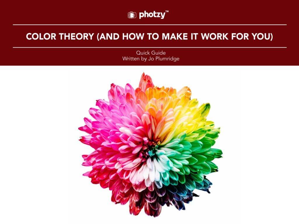
Unpack the color theory basics so you can create eye-catching photos. Learn how the color wheel, schemes, and variables like hue and saturation evoke emotions and add contrast or harmony. With tips on using RAW files and polarizing filters, this guide’s all about teaching you how to master color to craft bold or subtle vibes in your shots. Read more →
4) What Is Color Grading, and Why Would You Use It?

This one’s all about color grading—how tweaking hues, saturation, and levels can transform your photos’ mood and style. It’s all about creativity, not realism, so you can make your images feel warm, dramatic, or anything in between. Lightroom’s tools, like virtual copies and RAW editing, make experimenting easy, helping you craft a consistent, recognizable look. The best part? It’s subjective—no rules, just your vision. It could be uniting a series of shots or building your signature vibe, color grading gives your photography that extra pop! Read more →
Color tells stories. With techniques like monochrome focus, primary color pops, and creative grading, you can shape emotions and define your style. These guides give you the tools—now to incorporate them into your work!
